CMON Flights

Overview
CMON Flights is a startup that enables people to get better offers and make the whole travel market more efficient. At first, the company was an IATA-accredited online travel agency (OTA), that's why the goal was to create a product that allowed users to buy tickets directly from the app. Lately, the company's objective has shifted to a business model much more oriented to mediating between users and airline websites, facilitating their job, and enabling better offers for travelers.
The case study presented here shows the first MVP based on the OTA business model since the final product is NDA protected.
My Role
- UX research
- User personas
- Empathy maps
- User flows
- Journey maps
- Branding guidelines
- Design iOS App
- Design Web App
- Design Landing page
- Prototype iOS App
- Other marketing assets
Tools


Problem
By measuring benchmarks and through academic and user research of the travel market, we identified that the primary problem was to address the reasons for the drop in ticket purchases, which was due to the difficulty of finding the right offers, fulfilling people's overall needs, and price volatility.
The solution regarding this matter is part of confidential information protected under NDA and would not be included in this case study.
Solution
To achieve the product goals and align with the business strategy, I’ve designed an iOS app that is entirely founded on UX research findings, feedback from the team, and tight loops of design iteration; this allowed us to address user needs more accurately and bring us closer to meet the travel market demand. The product was primarily designed to meet the expectation of gen-z users, providing a seamless and efficient experience through a combination of familiarity and unique, impactful features. By creating interactive and video prototypes, we eventually got the airlines’ attention and presented it to potential investors; the contractor is currently handling the project autonomously.
Icebreaker
Competitive Analysis

User Persona

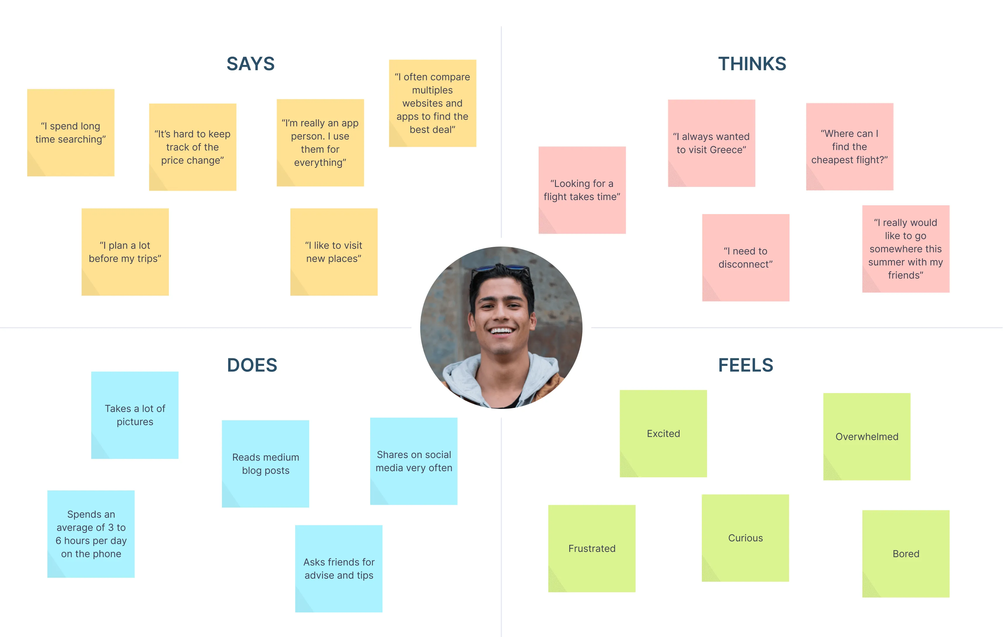
Empathy Map
Journey Map

Ideation
Build a travel app for youngsters that can't afford flight tickets to discover new journeys and places around the world.

Information Architecture

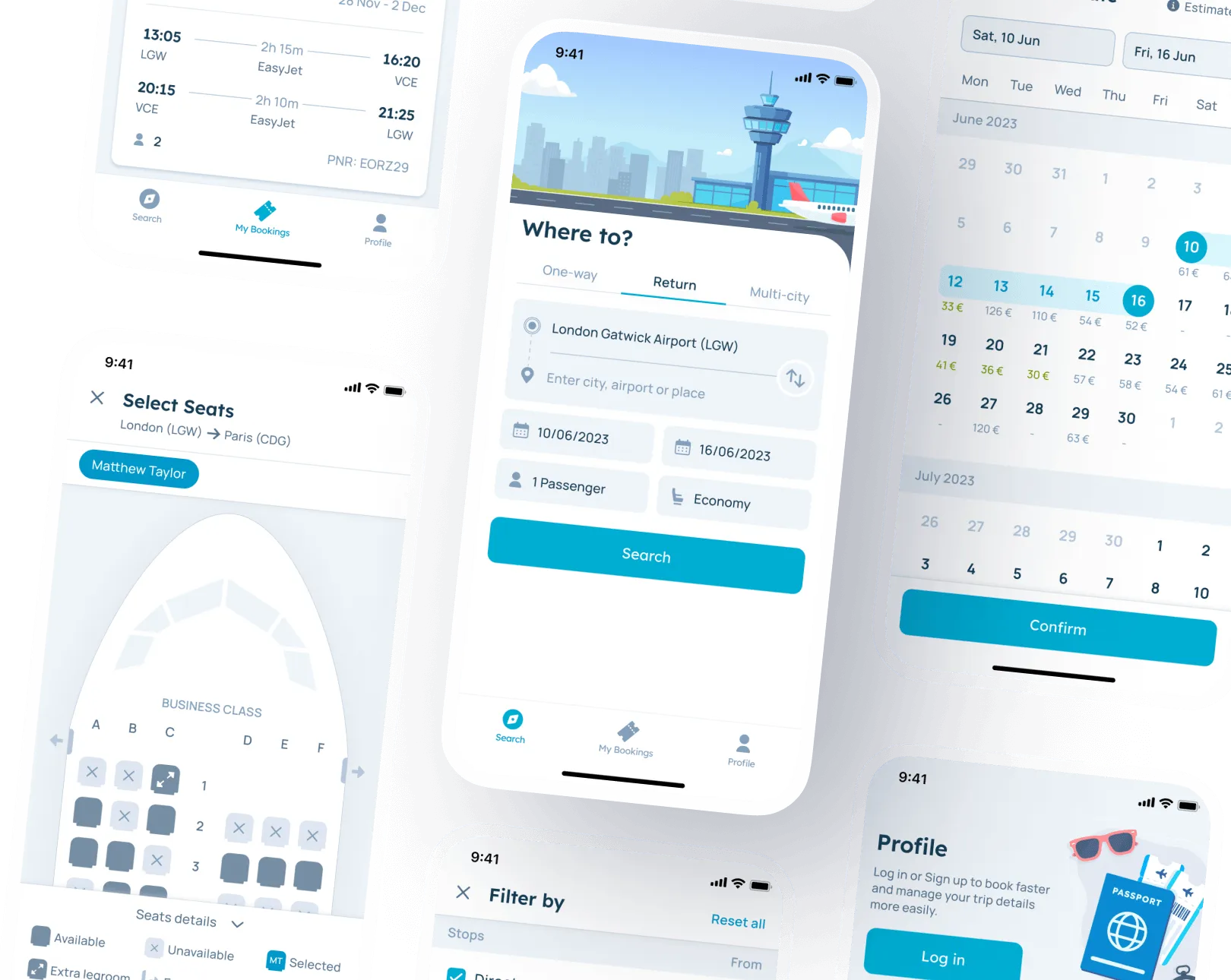
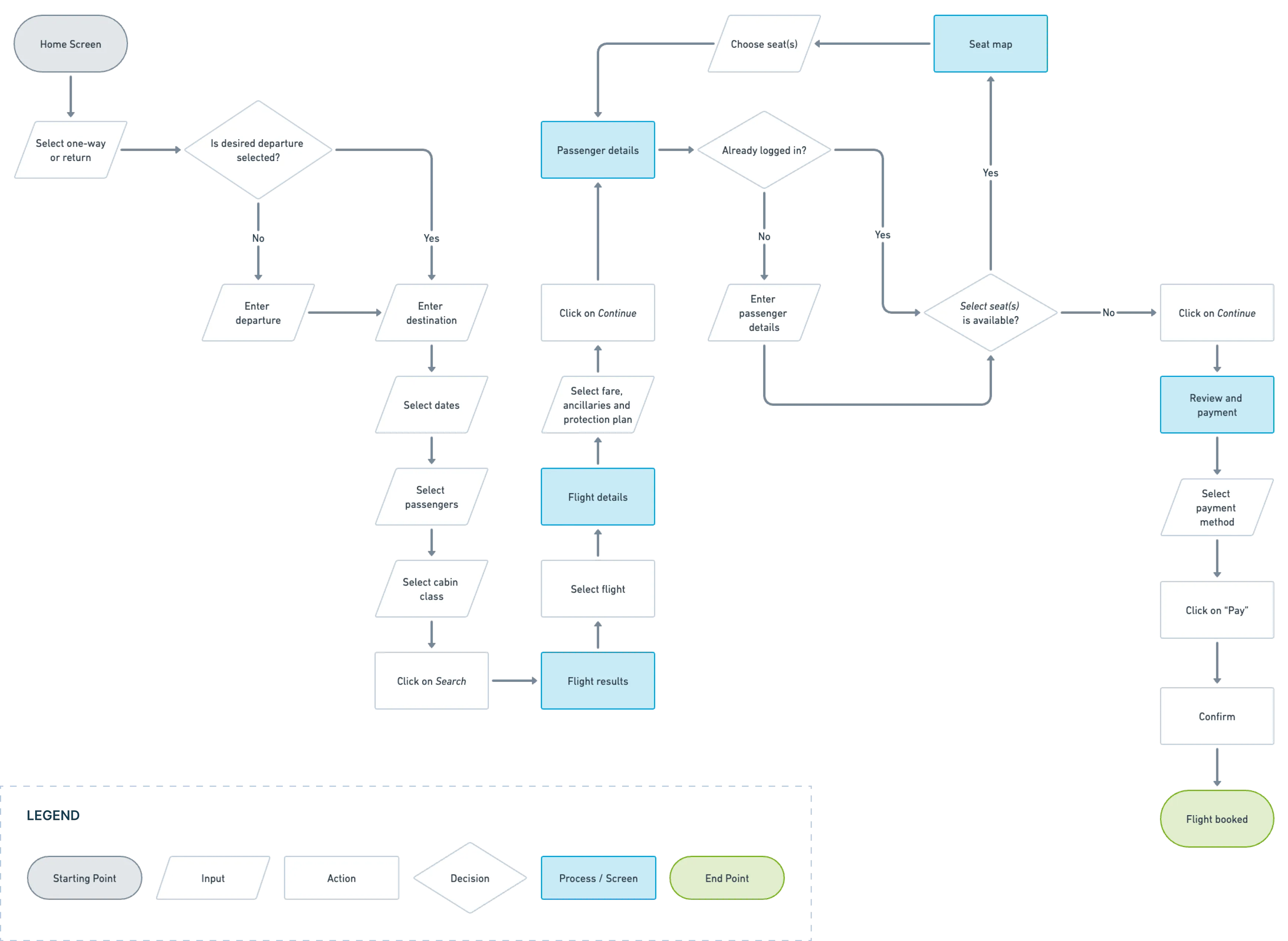
User flow
"As a traveler, I want to book a flight so I can fly to my destination."
Low-fi Wireframe


Mid-fi Wireframe

Visual Identity

Typography

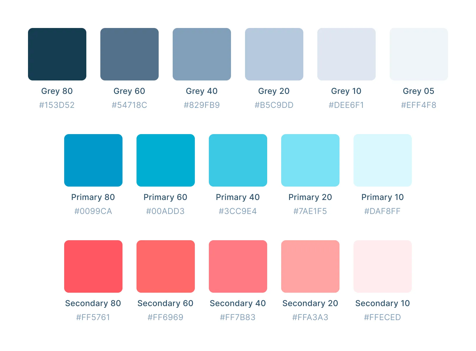
Colors
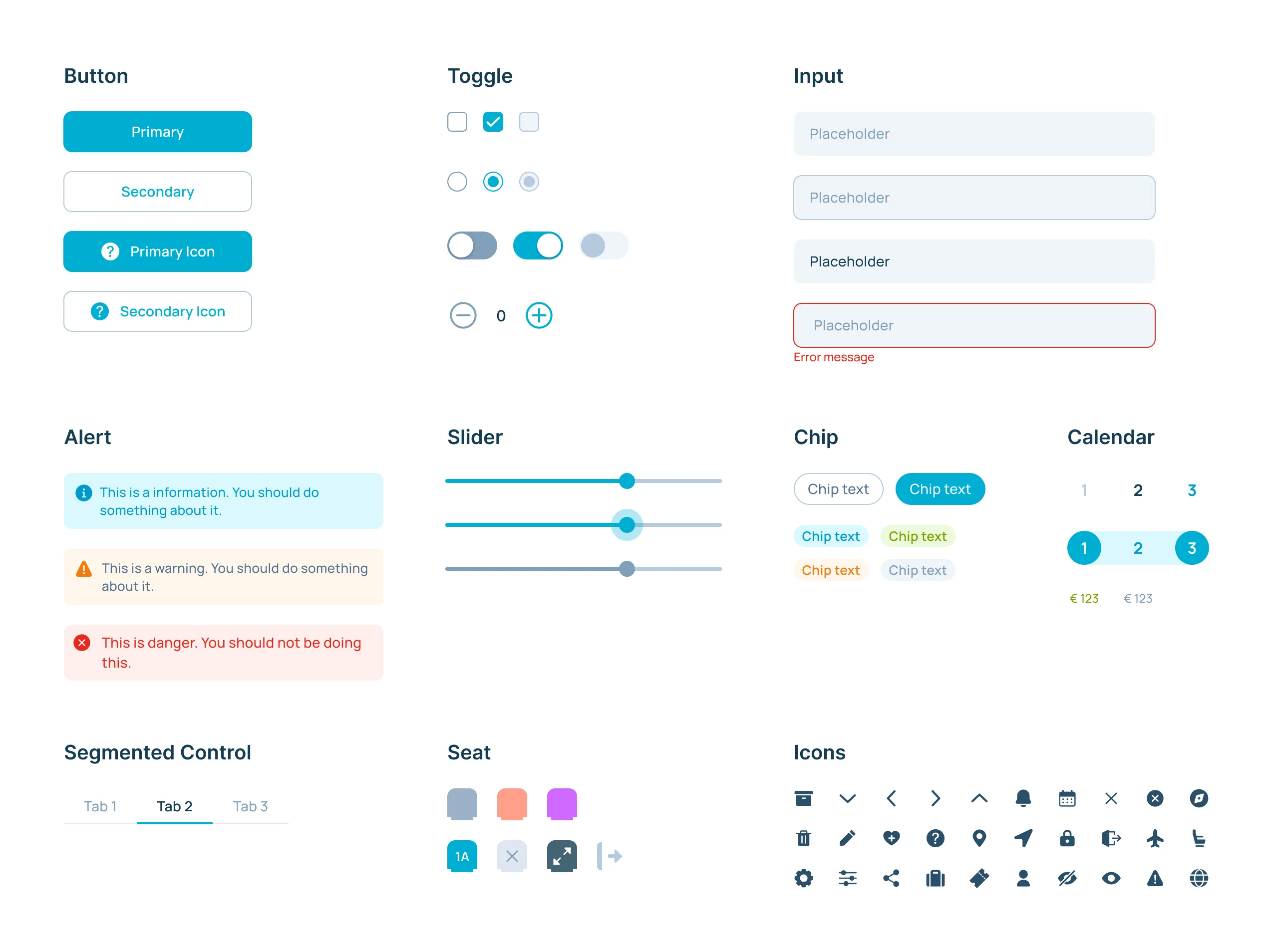
Components
Hi-fi Design
.webp)
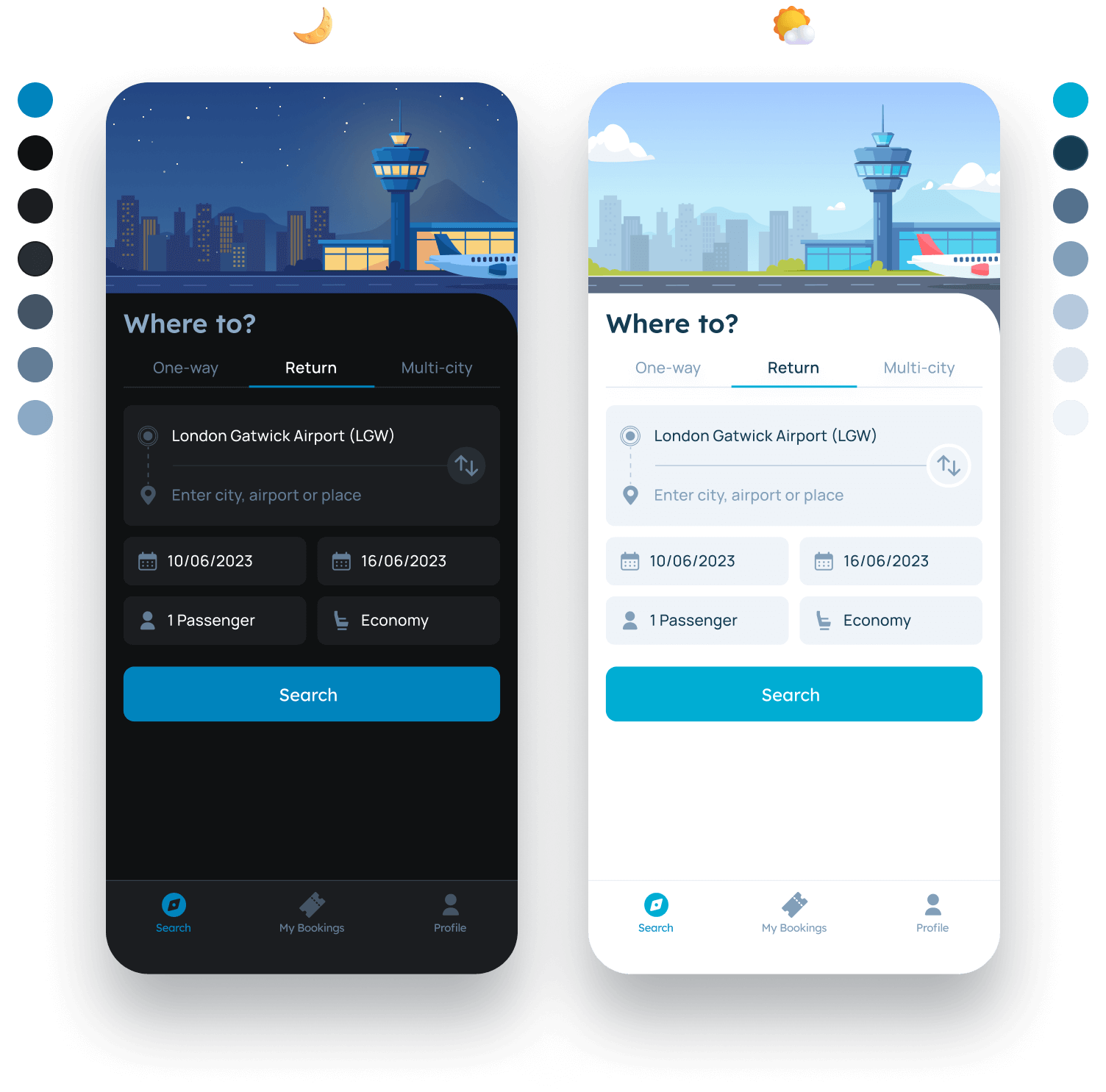
Dark Mode
Prototype
